
The control chart is a useful tool for tracking continuous improvement efforts and their impact on the process. We discuss how to apply process behaviour charts and interpret the data.
Lean, at its core, is about a deep respect for humanity and about visualising what is occurring in any given process. This allows us to expose waste and identify opportunities for improvement. It is about creating a fundamental way of thinking and attaching tools to guide the way. These tools assist in developing desired habits and behaviours.
There are a multitude of Lean tools and concepts which serve to create pull and flow in the process. These aid people in getting the most out of the process and help to focus on the method of the continual improvement of process and outcomes.
The control chart
One significant tool in the Lean arsenal is the control chart (or process behaviour chart). This is sometimes referred to as the Shewhart chart, or a Statistical Process Control (SPC) Chart.
It is one of several visual tools typically applied to quality control analysis. The chart enables us to understand how a process behaves and changes over time. Invented by Walter A Shewhart in the 1920s, control charts are used in numerous industries as part of continuous improvement methodologies.
Shewhart understood that no matter how well a process is designed there will always be variation within that process. SPC is an effective technique for variation monitoring and control provided that its limitations are recognised. SPC is primarily concerned with monitoring the process – not the product or service it produced. If the process is in control, capable, and consistent then the outputs of the process will be good.
Similarities between the process behaviour chart and run chart
A process behaviour chart is similar in many respects to the conventional run chart; it’s really just an extension to it. A run chart is a powerful, simple-to-use process improvement tool. Any process is essentially defined as a series of transformational activities that changes a set of inputs into a discreet set of outputs.
Process change happens over time. Determining if and when a change has happened – and if that change sustains over time - is critical to process improvement.
A run chart is typically used to determine the mean (central value) of a process and whether or not that mean is changing.
A run chart is extremely simple to use – it plots observed values on the y-axis and the times they were observed on the x-axis. Run charts are similar to process behaviour charts but do not show the control limits of the process.
They are simpler to produce; as such they do not allow for the full range of analytic techniques that a control chart supports.
Interpreting control chart data
When a process is stable and in control it displays natural variation - variation that is inherent in the process. A process is deemed to be in control when based on history it can be reliably predicted how the process will behave (within limits) moving forward. We visualise and analyse numbers in order to understand when a change has occurred in our process.
It is important that we are alerted to the changes in a timely manner so we can respond effectively. This may sound straightforward - in some respects it is - however, the output numbers can change even when the process does not. It is important in our analysis that we have a method to distinguish those numbers that represent changes in our process from those that are noise or natural variation.
This is where the process behaviour chart comes into its own. Walter Shewhart made a critical distinction between the types of variation in the numbers. Some of the variation in a process is natural or routine variation, it is variation to be expected even when nothing in the process itself has changed; other variation is exceptional. The exceptional variation is considered to be abnormal and can be seen as a signal of a change or something different happening in the process.

The four states of processes
Processes fall into one of four states:
The Ideal
The process is in statistical control and produces 100% conformance to customer expectations. This is considered a predictable process and consistently meets the customers demands.
The Threshold
The process is characterised by being in statistical control but still produces the occasional non-conformance. This type of process produces consistent levels of non-conformance. Although it is predictable it will not consistently meet customers requirements.
The Brink of Chaos
The process is not in statistical control but is not producing defects. The process is unpredictable but the outputs still meet customer specifications. A lack of defects can create a false sense of security yet the process is capable of producing deviation at any time. It relies on good luck rather than good design.
The State of Chaos
The process is not in statistical control and produces unpredictable levels of non-conformance. In a word: Chaos.
Every process will fall into one of these states at any given time yet will not remain in that state. All processes will move toward the state of chaos over time. Unfortunately, most organisations only begin improvement efforts when a process reaches the state of chaos. By this stage they have created significant internal waste and damaged customer service and reliability.
Distinguishing the process behaviour chart from other tools
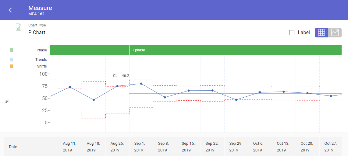
Without going into too much detail, a process behaviour chart helps us by creating a central line around the average of the data points as in a run chart. Where the process behaviour chart differs is that it adds control limits. Upper and lower control limits (UCL and LCL) are calculated from available data and placed equidistant from the central line. The control limits serve the purpose of ensuring we are intentional in our improvement activity. They represent the normal distribution of data within the control limits and signal exceptional variation when data points fall outside of them along the process behaviour chart.
There are a number of variations of the control chart and considerations to be taken into account when identifying the appropriate chart to use.
Knowing which control chart to use in any given situation will ensure the accurate monitoring of a process’ behaviour and stability. Ultimately utilising a control chart will eliminate erroneous conclusions and wasted time or effort. This allows for focused, intentional improvement activity to occur by exposing the correct opportunities to chase.
Consider processes in terms of the greater C.I. Framework
When experimenting with, reviewing, and developing processes we must consider how they fit into the greater continuous improvement framework. No process should live in isolation as a 'locally-optimised island'. Ensuring that we keep adjacent processes and systems in mind is key. The interconnection of Lean tools like standardised problem solving techniques, Standard Operating Procedures (SOPs), and a Tiered Daily Management process that supports the entire PDCA loop is critical.
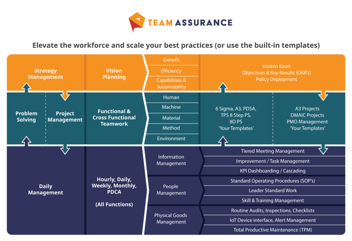
The illustration below demonstrates how we designed the interconnected TeamAssurance platform to avoid disconnected ‘Point Solutions’ (digital or analog) that do not help, and may even hinder the development of an organisation’s processes.
If you’re a business in need (or a consultant with clients in need) and you'd like to explore the opportunities that digital-aids to Lean tools provide contact us for a demonstration of the TeamAssurance platform today.